Ink & Oak
Client:
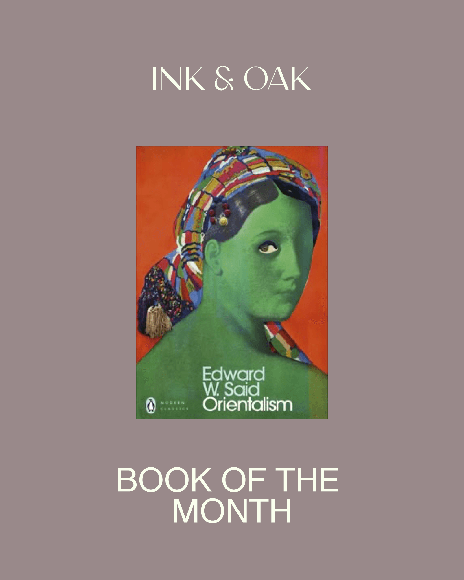
Ink & Oak
Industry:
Food & Beverage

The Challenge
Ink & Oak was never meant to be just another bookstore or café. Founded by two educators with a deep love for reading, it set out to offer something rare, a physical space where people could pause, reconnect with paper, and feel part of a thoughtful, curious community. The challenge was to build a brand that felt just as intentional and comforting as the space itself.


In a world of overstimulation, the real luxury is slowness. Ink & Oak’s charm lay in its pace and purpose, it didn’t shout to be seen. The opportunity was to build a brand that invited people in quietly, celebrated thoughtful exploration, and reminded them that reading isn’t a task, it’s a feeling.


Our Approach
We developed a visual identity that blended classic literary warmth with modern elegance. The oak-leaf-and-dot icon became the heart of the brand - evoking ink-dipped quills, community, and quiet imagination.
A calming, muted palette and timeless typography shaped the overall design system, while the tone of voice remained gentle, reflective, and inclusive. Every detail - from signage to stationery was made to feel like a welcome whisper, not a loud announcement.

The Impact
A brand that feels like a deep breath.
Ink & Oak’s identity created a space that people didn’t just enter, they exhaled into. The brand brought comfort to the curious, elegance to the everyday, and a sense of connection to everyone who walked through its doors. In a world that rarely pauses, Ink & Oak became a space and a story that invited you to.