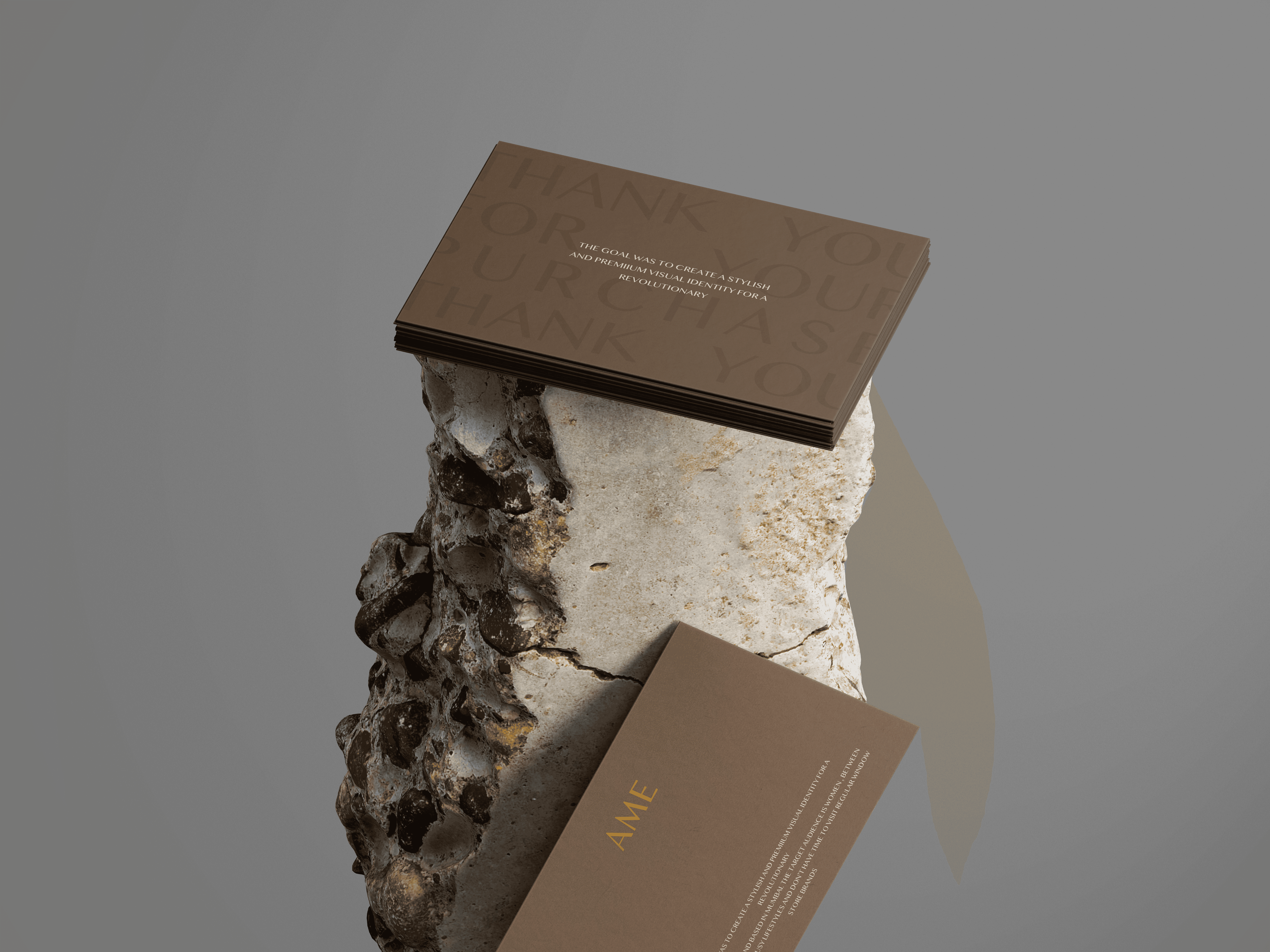
AME
Client:
AME
Industry:
Fashion/Apparel

The Challenge
AME was entering the slow fashion space with a clear vision: to embody quiet luxury for women who value timeless design and intentional elegance. The challenge was to translate this subtle sophistication into a brand identity that could resonate with a discerning, style-conscious audience.


In a market saturated with loud aesthetics and fleeting trends, AME’s strength lay in its restraint. Its audience, women in their 30s to 50s – was looking for fashion that didn’t chase attention, but held it with quiet confidence.


Our Approach
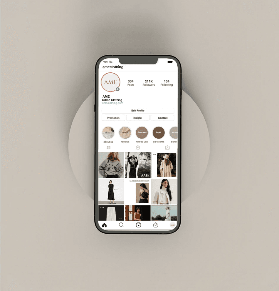
We crafted a visual identity that felt as graceful as the attires themselves. The main logo was minimalist yet intentional, while the secondary mark introduced softness and intimacy.
From typography to visual system, every detail was designed to reflect the brand’s balance of elegance, substance, and stillness – luxury that whispers.

The Impact
A brand that let elegance speak for itself.
AME’s identity now mirrors its philosophy – graceful, grounded, and enduring. The branding became an extension of the wearer: refined, personal, and quietly powerful. With every impression, AME left behind more than style – it left resonance.